

Studio Figma by Siteglide offers a best practice, Bootstrap 5 based design to rapidly create far more than just websites.
The Studio Figma file is a collection of ready-made Components, Blocks and Pages for you to build, design and customise pages to reflect your branding and style. You can then integrate them to create fully designed Studio pages, which you can make using the Siteglide Studio Module.
Within this doc, you can find helpful information covering Figma, such as:
Introduction
You will have total control within your own duplicated Studio Figma design file. Customise Studio Figma and go straight to the Studio Module and develop your design.
How To Use
Prerequisites
Before you get started using the Studio Figma file, you’ll need to have a minimum basic understanding of the Figma design tool and a Figma account. We’ve included a link to the official Figma help documentation and a link to their website to help you start.
Branding
Here is where you’ll set the primary brand colours, logo and typography for your version of Studio Figma. We have made it simple for you to change all of these quickly and easily withing Figma.
1.1 Colour Globals
In this section, you'll find six colour groups, and within each colour group, you will discover variants of colours to use for your designs within Studio Figma.
Modifying these colours is as simple as selecting the colour style you would like to change and then altering it. These changes will then carry throughout the designs that have already been prebuilt for your convenience.
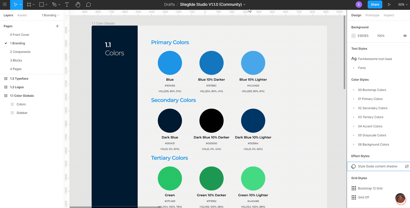
To understand where the design colour object associations lie, you can simply advance to the Component and Block pages within the Studio Figma file.
From there, you can also change the colour of the selected object or alter the global colour of the selected object.
Note: This will then change all other objects associated with this colour)
1.2 Logos
This section shows two versions of our logo, one colour and one white.
It is considered best practice to have a logo that can contrast with different colours, especially light and dark, can increase your design’s versatility.
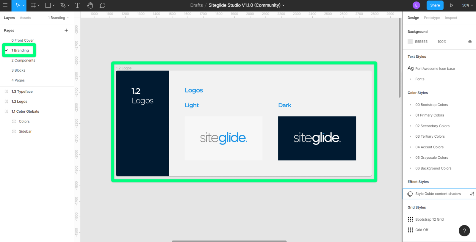
To change the logo within this file, you will need to swap the “Logo Image” layer with your chosen logo.
The recommended file type for this would be an SVG file, as this allows you to scale your logo to your needs without distorting the quality. However, should you not have access to an SVG version of your logo, the Figma design tool supports the following image file types:
- SVG (Vector files)
- PNG, JPG, GIF (Image files)
Once you have swapped out the logo for one of your choosing, you will see the change throughout your Studio Figma file.
1.3 Typeface
Within this section, you will find typefaces used for heading and body text.
We have created text styles to make altering your chosen typeface relatively simple within Studio Figma.
You will also find that heading and body text will have their components and variants already created; this will help you create a consistent look and feel for your designs. When creating your designs, you can also swap between components that contain your typefaces for ease of versatility.
https://image.siteglide.com/X6ubJ7d6
Components
This section includes various components, which will enable you to build new layouts and blocks rapidly. Components are interchangeable, including each variant within the component. You can also change specific properties within a new instance of a component, allowing you to be versatile with your design and creativity.
2.1 Icons
Within Studio Figma’s icon section, you will see the FontAwesome icons (FontAwesome5.15.2) used in creating the prebuilt designs. Each icon is in its component, and each component will have three variable sizes:
- Base
- Medium
- Large
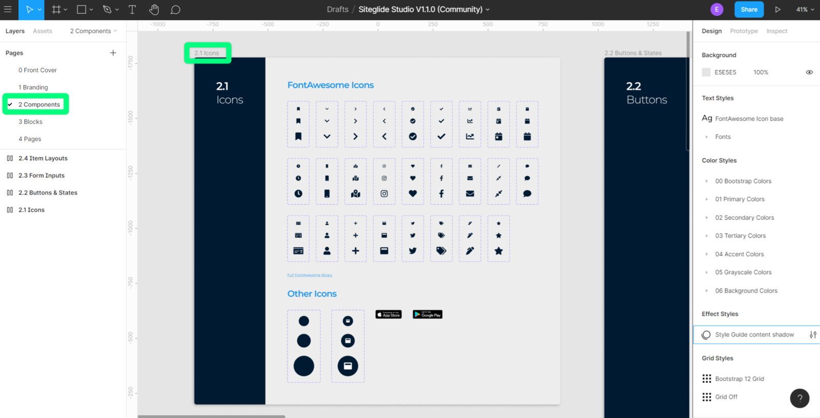
These icons will allow you to maintain a consistent look and feel throughout your design. You can add more component icons to the current set by using the FontAwesome Free Icons set and creating your component icon using the following naming convention:
- .Icons/ [name]
- E.g..Icons/ chevron-down
When you have created the new icon component, you will need to convert them into a component variant. Each of these variants will have three sizes, base, medium and large:
- Base
- Medium
- Large
We have also included a section for other icons which don’t currently fit into the set. You can use this area for miscellaneous icons which do not fit into your design or may have a one-off use.
2.2 Buttons & States
This section includes buttons which include their states and a secondary outlined version, as a best practice we have also included buttons with bootstraps various warning colours as buttons.
The button components help the design process along when creating inputs and modal popups which require user notification of an optional, primary or secondary action.
https://image.siteglide.com/7KuAgW0B
Button text is readily editable when a new instance of a button component is created. The button width will automatically fit around the text, making resizing the new instance a simple.
2.3 Forms & Inputs
This section includes form inputs which include a disabled state. Adhering to best practices and making the design process easier for you we have kept with Bootstraps sizing.
https://image.siteglide.com/12uPqkyl
2.4 Item Layouts
Within this section, we have used the main components from previous sections.
Doing this, we have created item layouts. Item layouts are components which will be used repeatedly within a design, e.g. a blog card or a particular form. Item layouts also carry the advantage of specific properties that are editable within a new instance of itself.
https://image.siteglide.com/Wnuk46Go
Blocks
Blocks are premade components which help you rapidly design pages. Blocks also have the same advantages as Item layouts and components.
3 Blocks
You can edit the master component for global changes to all instances or edit the instances for finite control of your design.
The Blocks are divided into four different sections, but can be used however you like:
- Template
Template Blocks are used for creating Headers and Footers in Siteglide to build out Page Templates.
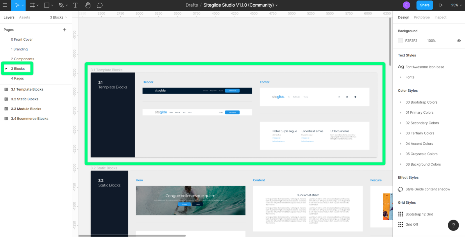
- Static
Static Blocks are used for creating the body of Pages and include Blocks such as: Hero, Content, Feature, Team, Pricing, Contact and Signup.
https://image.siteglide.com/Wnuk46By
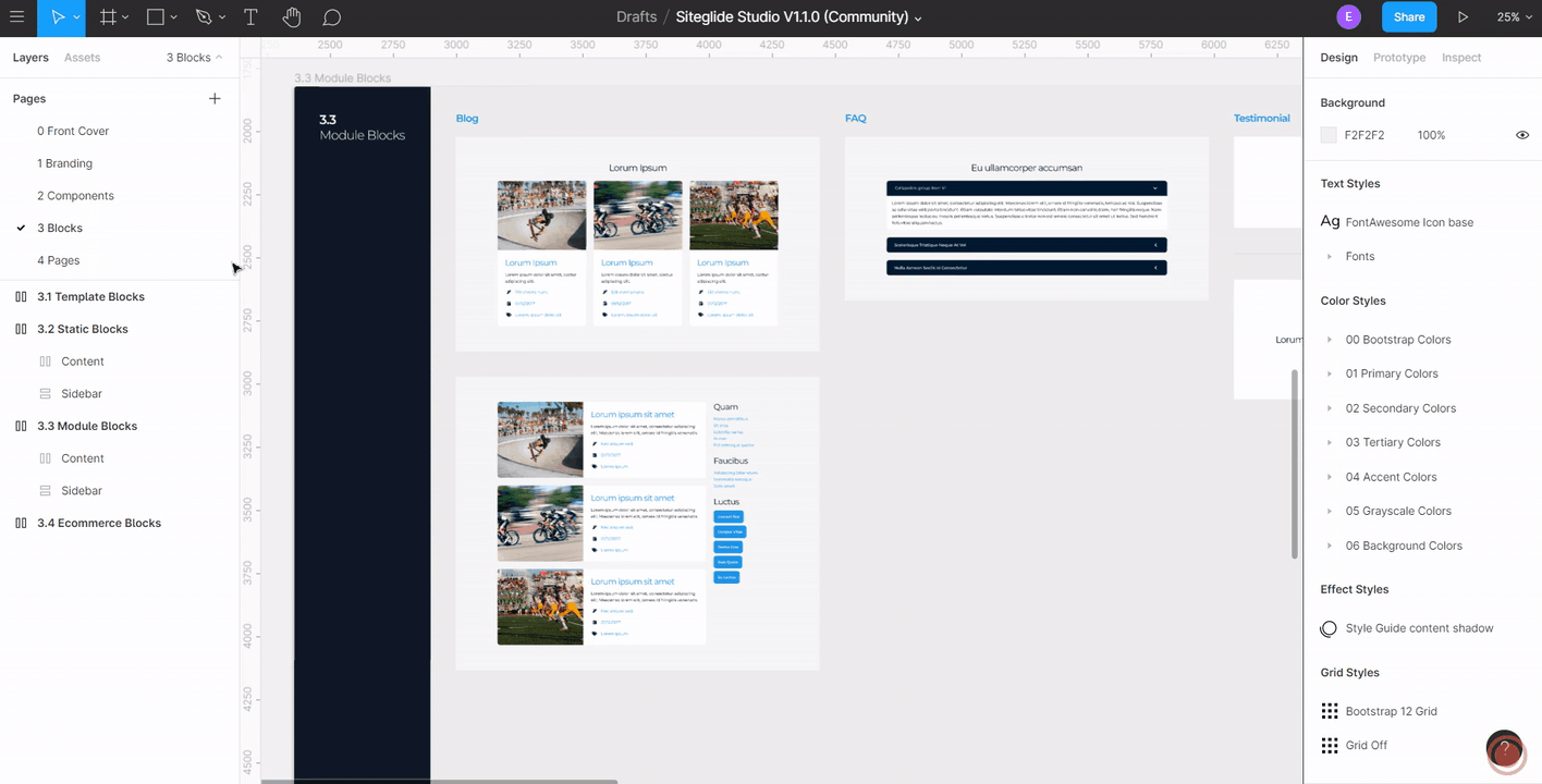
- Module
Module Blocks are used for creating Module layouts in Admin so contain some specific Blocks related to these, such as: Blog, FAQ, Testimonial, and Events.
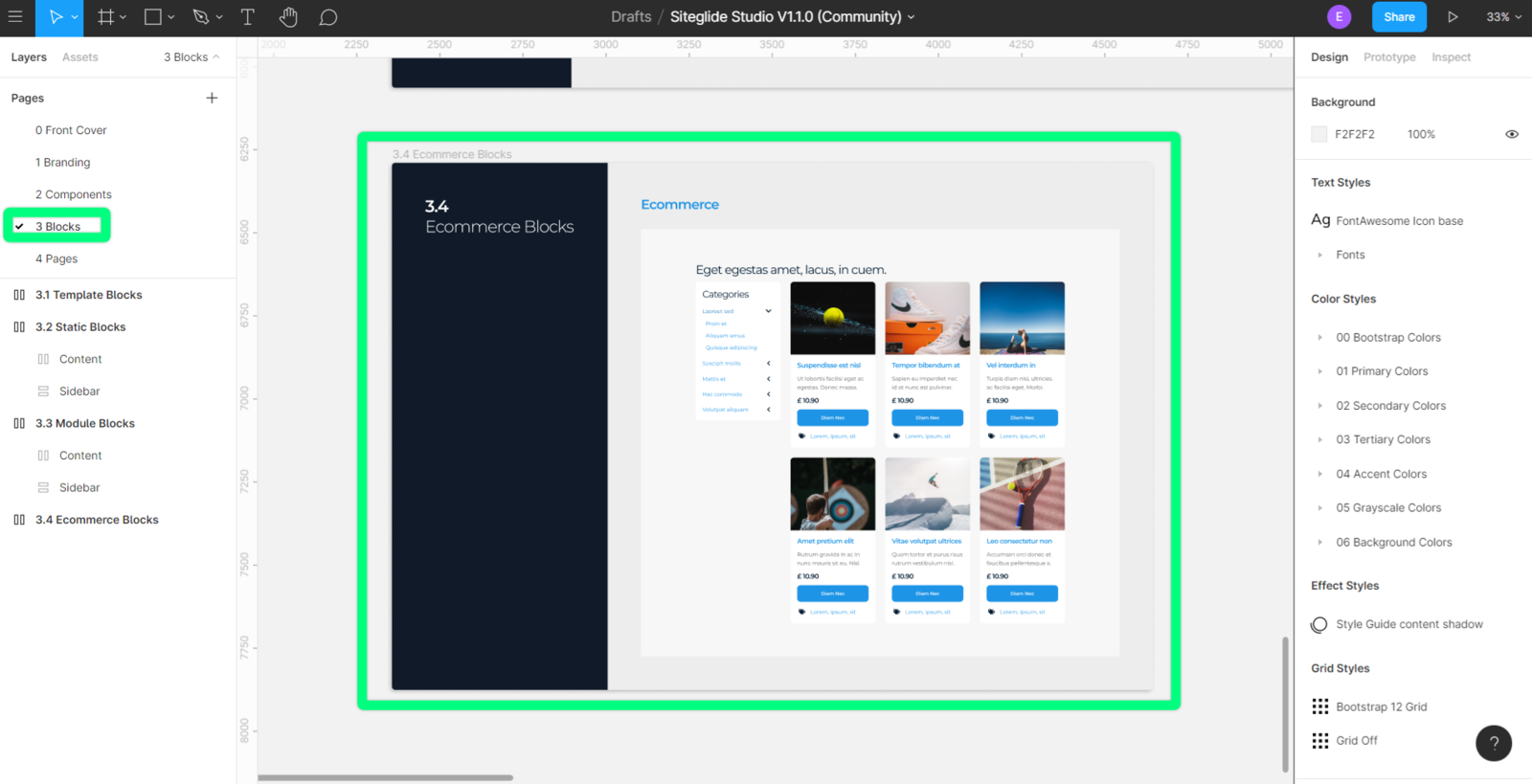
- eCommerce
eCommerce Blocks are used for creating layouts specifically for eCommerce Pages.
You are also able to create your blocks by merely combining the existing components when you have created a new component block you can use the following naming convention:
- [Section numbers] [name]/sg- [name] - [block number]
E.g 3.3.1Blog /sg- blog - 02
Demo Site Pages
We have created pages in Figma that will already exist within your Demo site.
Each of these pages is configurable to your design. Each of these blocks is an instance of its master component.
4 Demo site pages
You can edit them individually or edit the master component to make global changes to the item.
The block components within each of these pages are also interchangeable, allowing your website to be fluid as possible while also making sure that you can appeal to your audience.
https://image.siteglide.com/2NuPKpqg