

These global Sass variables will serve as the base of your branding and, in combination, with Blocks and Pages provided in Layout Library and Visual Page Builder, you can build websites faster.
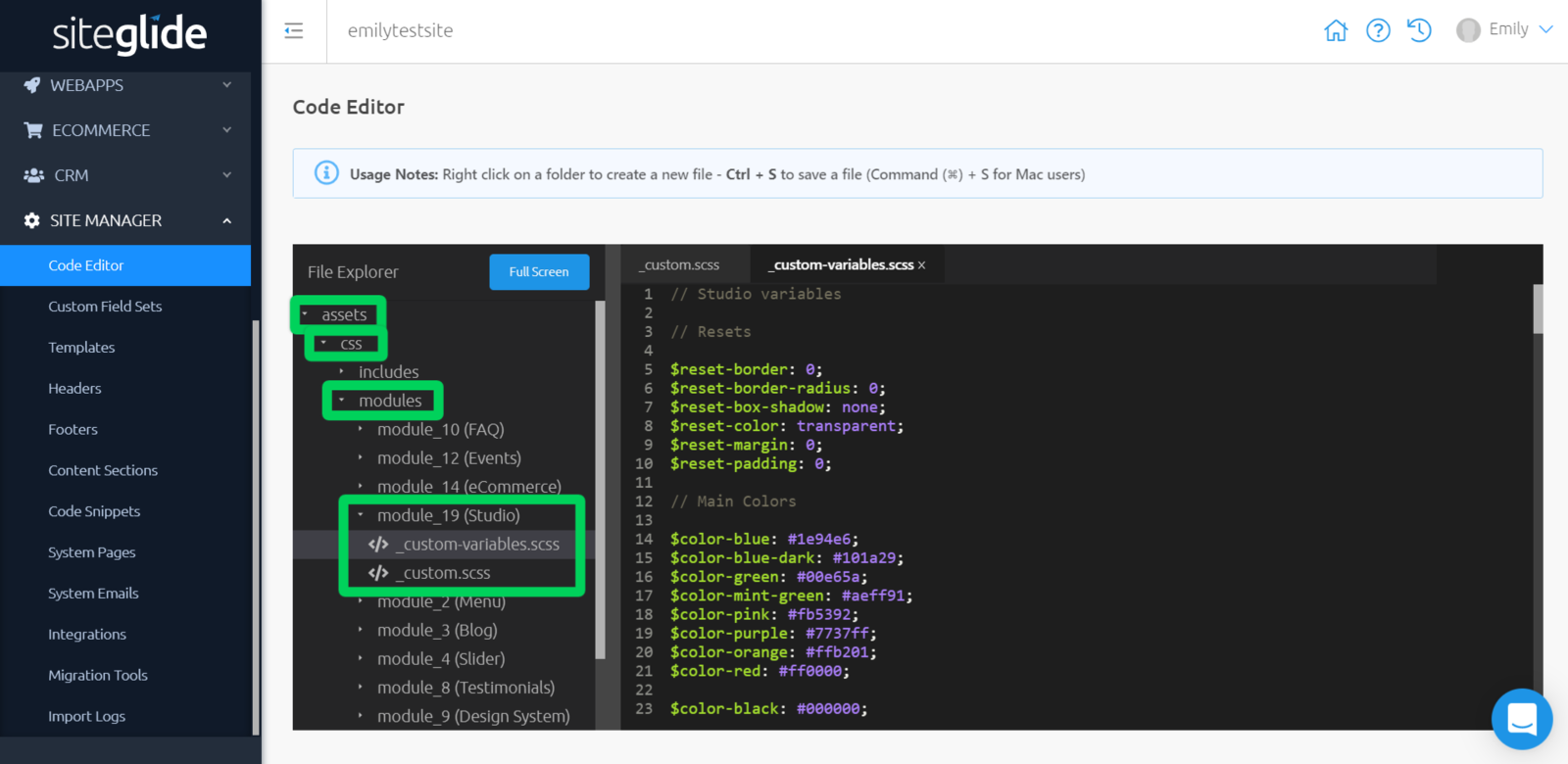
These can found with Code Editor > "assets" > "css" > "modules" > "module19 (Studio)" > "custom-variables.scss"
Customising With Studio
If you have Studio Module v.1.0.0 installed, you will be provided with your own _custom-variables.scss file, which includes OLD Studio variables for you to customise. From here, you have freedom to do any of the following actions:
- Edit the values of variables already provided, or
- Create new variables to take your customisation further.
Note: Since Bootstrap 4 is included as part of the offering from Studio module v.1.0.0, you also have the freedom to copy variables from the Bootstrap source code and overwrite their default values.
Basics to get you started:
You have complete freedom to change any values you see fit. If there is something you do not like and wish to revert, you can always copy the old variables from our Studio - OLD Studio Variables (v1.0.0).
"$color-blue:" is the variable name.
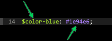
"#1e94e6;" is the value.
Note: If a variable name is changed, then all references to that variable, will need to be changed too.
"Resets"
"Resets" are offered as a means to quickly reset a style back to its barest state. These are particularly useful if you want to quickly overwrite a style, for a layout, that is part of Studio module or Bootstrap.
"Main Colors"
"Main Colors" represent the main colour palette for Studio layouts. These will typically be used to represent your branding or unique colour scheme.
The variable name is followed by a colour value, with the colour value being represented as a HEX value.
To avoid confusion, if you change the colour value, it is recommended that you change the variable name to something similar.
Below the main colour palette, you have the primary, primary-dark, secondary and tertiary variables.
You can change the value of these to be a colour value or a variable name from above, this will reflect in your Pages where a primary colour is used, for example, your branding colours.
"Text Colors"
These contain the colours used for text on your Pages.
The variable name is followed by a colour value; a new variable (e.g. color-text-primary or color-text-secondary) which can be changed; and variables used in "Main Colors".
"Typography"
These contain the location of the fonts used, as well as the fonts for where they are applied, and text formatting.
Here, you can add your own fonts used for your Site; and you can change the sizes used for each format of text by changing the number or percent value after the variable name.
"Body"
This contains one line of code, referring to the body of any page:
$body-position: relative;
This does not change anything to the element itself, but instead affects anything inside this with a position other than "relative". This acts as an anchor for any elements inside.
"Anchor"
This contains one line of code, referring to any anchor tags that have been added:
$anchor-cursor: pointer;
This is changes your cursor to look like it does when you hover over a link.
"List"
This contains one line of code, referring to any lists that have been added:
$list-style-position: inside;
To explain this with an example: if you had a bullet pointed list, the bullet points would be classed as part of this list item and will indent any text where necessary.
"Button"
This contains all of the code necessary for buttons on your Site.
Here, you can change the button border radius, border width and button width using a number or percent value.
You can change the all primary, secondary, tertiary, success, warning, danger, and outline colours with a colour value or using variables from "Main Colors".
You can also change the border radius for buttons with the following line of code:
$btn-link-border-radius: $reset-border-radius;
"Icons"
This contains one line of code, referring to any icons that have been inserted:
$icon-font-size: 45px;
This enables you to change the size of any icons used on your Pages.
"Breakpoints"
These are the different viewport sizes that nearly all devices adhere to, and these are where the design of a page can drastically change.
For example: desktop view to tablet view, or tablet view to mobile view.
You shouldn't need to edit these, although you can do if you would prefer to.