

What is Figma?
Figma is a browser based interface design tool, it lets you build and even prototype website and apps efficiently. One of Figma's strengths is its collaborative nature, that lets your colleagues/clients give feedback on your work while you work. You can read more about Figma on their website.
What is a Design System?
Design Systems allow you to manage design at scale, using reusable components such as text styles, layouts for common elements including buttons and form elements and lastly swatches and styles that can be updated globally with a simple change.
This enables you and your team to work efficiently and more important consistently. You can read more about Design Systems here.
Getting started
First and foremost, this is not a tutorial on how to use Figma, there’s plenty of resources around the internet for that, I will however reference guides/tutorials throughout this document for you to reference. It’s fundamentally a guide on using the Siteglide Design System to build fast, cost effective interfaces. Let’s get started...
Install guide
If you don’t have an account already, sign-up to Figma. For small individuals and very small teams its free. Larger teams visit https://www.figma.com/pricing/.
Once you’ve logged in, familiarize with the dashboard and then download the .fig file from XXXXXX then click the import button in the top right of the dashboard and that’s it!
Overview
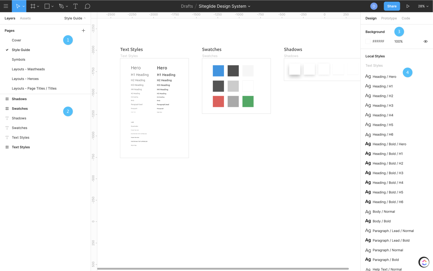
Once you’ve import the file, you’ll be greeted with the cover page.
- These are pages, they hold all the layouts, styles and symbols that make up the Design System.
- Once you’ve selected a page, you will then see all the frames, layers related to that page
- There are the artboard settings
- Here is a list of your styles and effects
Pages
Design System
As mentioned previously, this is where all the layouts, text styles and swatches are stored. If you select the page Layouts - Mastheads, this displays the various mastheads. Each layout is a component, you can learn more about components below.
Styles
Styles are one of the foundations of a Design System, they allow you to make a single change that will be reflected everywhere that style is applied.
Design System uses styles to let you globally change the font properties for all layouts, such as changing the font family for all paragraphs or making headings bold. Styles are also used for colour swatches that control the appearance of all your items.
${youtube}Styles
Typography
Components
Components
Without going into too much depth, components are reusable elements such as buttons, input fields and UI elements. As with styles, components can be updated globally, they can also be overwritten for unique instances. It’s highly suggested you read more into styles and components as they can become quite powerful.
Creating your design
Creating Your Design
Each person will have their own process in getting started but generally the steps I like to take first is setting up a new page, and then a starting frame.
To add a page you can click the + icon with the pages panel. Once added we need to set up a frame, this is essentially a wrapper of content and can be nested. As all the layouts within Design System are 1440px wide, i will make the frame the same width.
Adding layouts
To insert a layout within the Frame you can either navigated to your chosen layout then click and copy and paste the frame into your design or alternatively drag in from within the Assets tab.
To increase the height of the frame without distorting the internal elements, select the frame, then hold command/ctrl while dragging the bottom of the frame down.
Once you’ve added your chosen layouts to your frame, we can start customising these.